Skip to content

Case study2024

AURUM, crypto exchange platform

A regulated crypto exchange designed for complex onboarding, verification logic, and online/offline transaction flows.

Client
AURUM
Role
Lead UX/UI Designer
Platform
Web & Mobile
Industry
FinTech / Crypto, regulated
Tools
Figma, Protopie
Timeline
12 weeks, 2024

Scope: UX research, UI design, design system, prototyping. 196 screens, 2 platforms, 3 UX stories.

aurum.exchange
AURUM Exchange Dashboard

Story

00Story

00.1Hook

What if crypto trading could feel as simple as sending a message, secure, fast, and beautiful?

00.2Friction

Existing crypto platforms overwhelm users with cluttered dashboards, confusing charts, and intimidating verification flows. New users abandon. Experienced traders settle for poor UX.

00.3Pivot

We designed AURUM around progressive disclosure, showing only what matters at each step, with guided onboarding, contextual education, and confidence-building visual feedback.

00.4Proof

196 screens. 64+ components. Mobile-first responsive design. End-to-end crypto exchange platform covering trading, transfers, verification, and portfolio management.
In short
Problem
Crypto trading felt cluttered and unsafe: new users stalled, experienced traders lost time switching between features.
Key flow
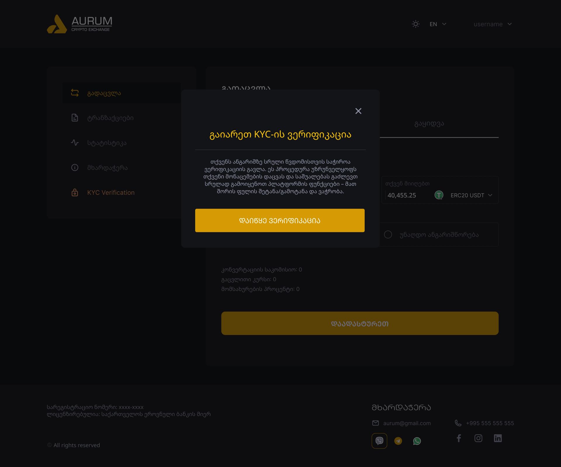
Verification. A long, opaque KYC step was split into a guided sequence, one action per screen, with security status shown at every step.
What shipped
Onboarding and KYC, trading, portfolio and transfers on mobile first, built on one design system of 64+ components.
My role
UI/UX designer in a large team, the link between the PM, the client and the developers through every round of decisions.
Where it stands
Launching now. Usability testing comes after launch; the first real use will show where verification still stalls.

01Project overview

Redefining cryptotrading experience

AURUM is a full-featured cryptocurrency exchange platform designed to make digital asset trading accessible, secure, and visually refined. The platform encompasses everything from onboarding and KYC verification to real-time trading, portfolio management, and peer-to-peer transfers.

Every interaction was carefully crafted to reduce friction and build trust, transforming complex financial operations into intuitive, confidence-inspiring experiences.

ScreensFull product
196
ComponentsDesign system
64
Color tokensBrand palette
8
PlatformsMobile & desktop
2

02Challenge & solution

Complexity was the barrier, for new usersand experienced traders alike

The challenge

Crypto platforms struggle with overwhelming complexity, creating barriers for new users while frustrating experienced traders.

  • Cluttered, intimidating trading interfaces
  • Complex multi-step KYC verification
  • Poor mobile trading experience
  • Lack of trust-building visual cues
  • Confusing navigation between features

The solution

A clean, confidence-inspiring interface built around progressive disclosure and trust-first design principles.

  • Simplified trading with contextual data
  • Guided step-by-step verification flow
  • Mobile-first responsive architecture
  • Security indicators at every touchpoint
  • Intuitive portfolio & transfer management

Trust architecture

Four pillars, engineeredinto every touchpoint

01

Security

Multi-layer auth, KYC, 2FA, biometric

Every transaction · Every login

02

Clarity

Progressive disclosure, no clutter

One primary action per screen

03

Speed

Single-click trade execution

Sub-100ms response targets

04

Confidence

Verified status at every step

Visible audit trail

How trust is engineered into 196 screens, 64+ components and 3 surfaces.

03Key screens

Core experiences

From onboarding to portfolio management, each screen was designed to feel intuitive while handling complex financial data with care and clarity.

aurum.exchange
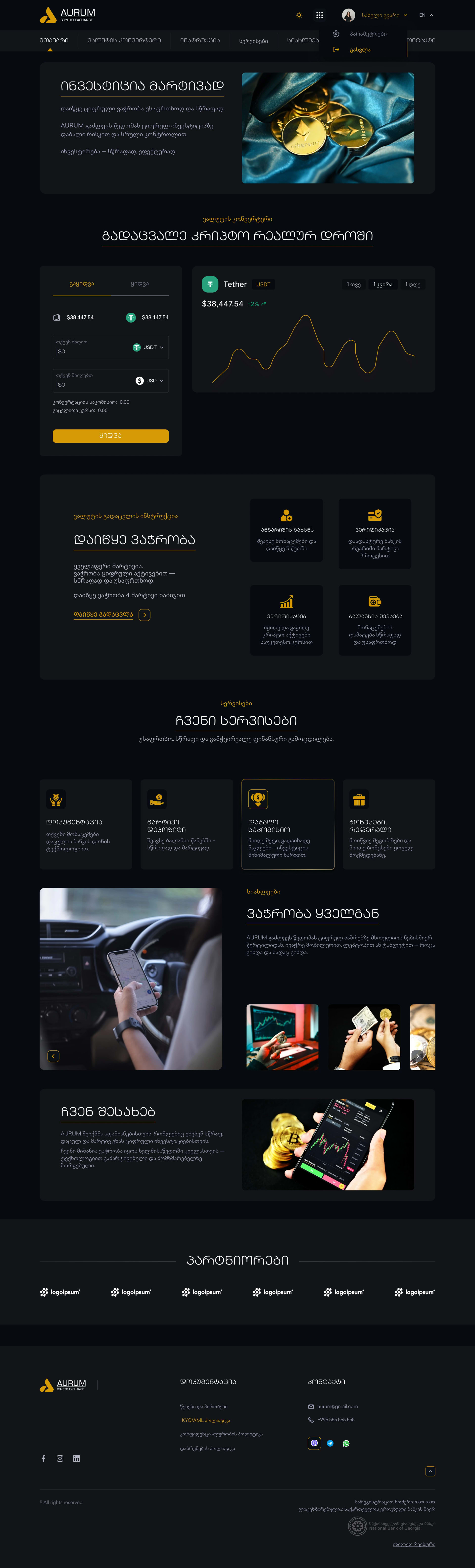
Home Dark

01

Home Dark

The landing experience in dark mode, showcasing the platform's premium aesthetic with gold accents, clean typography, and inviting entry points.

Dark mode · Landing · Brand identity

aurum.exchange
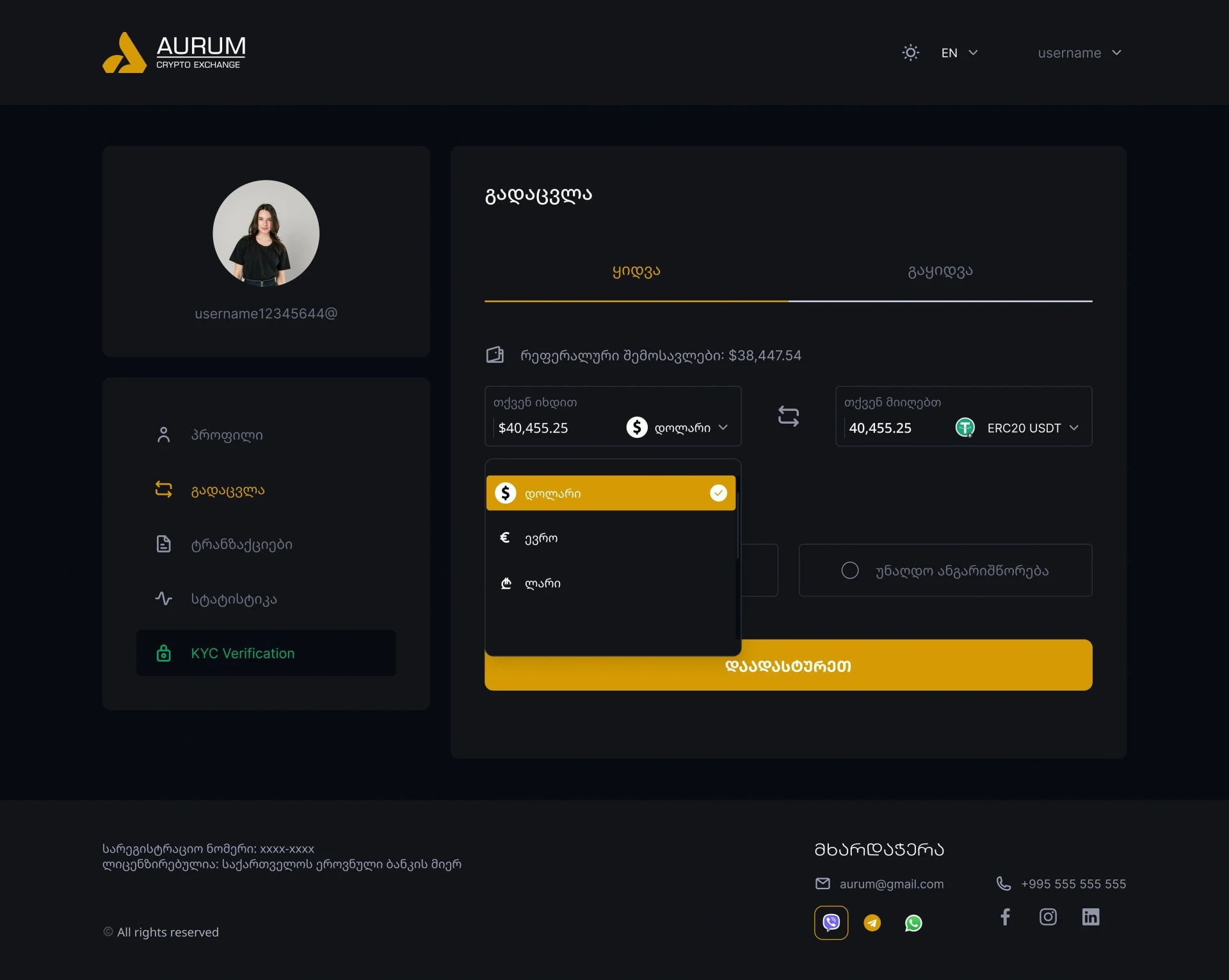
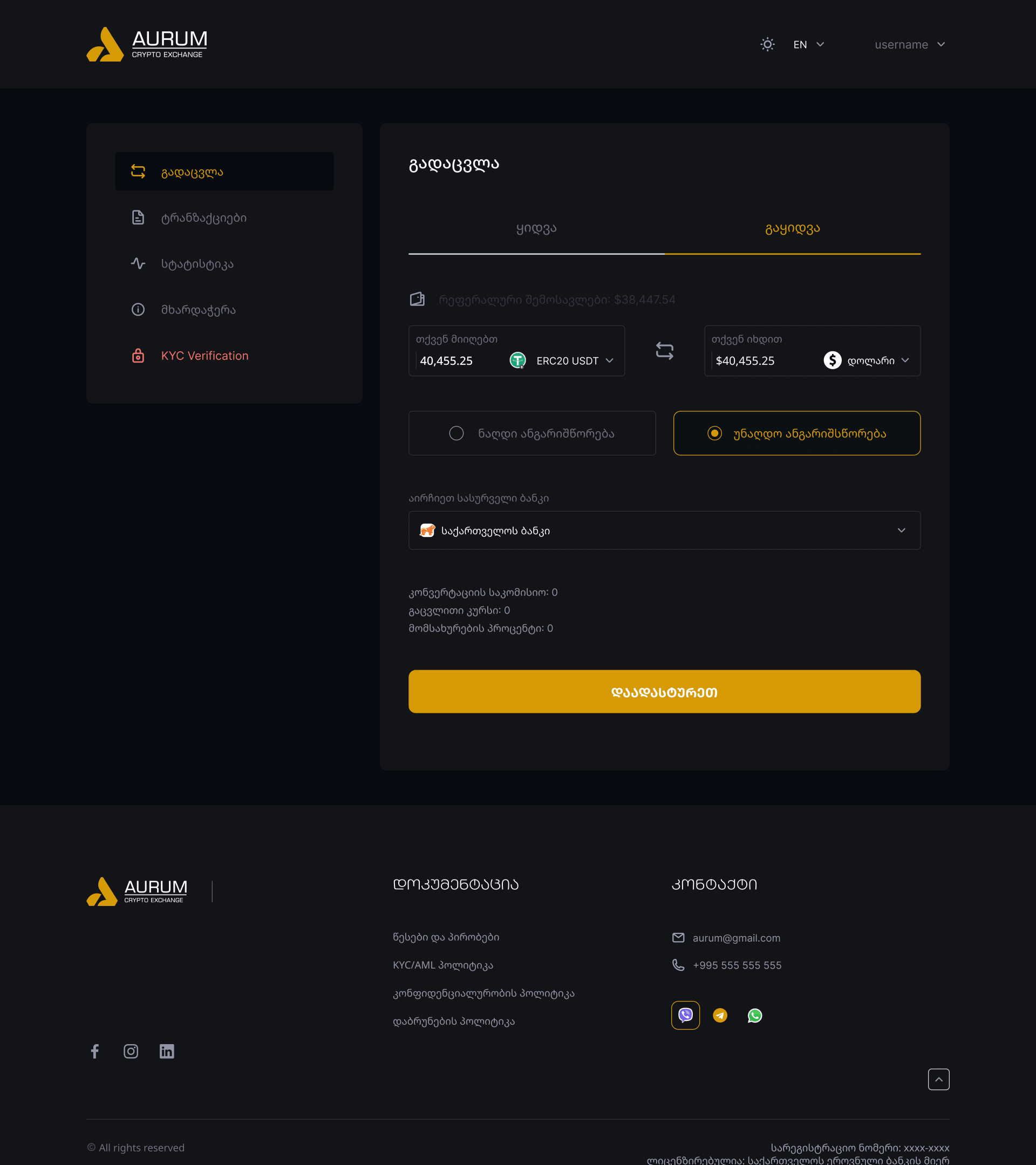
Exchange Dashboard

02

Exchange Dashboard

The heart of the platform, real-time market data, trading pairs, order book, and price charts unified in a clean, scannable layout.

Real-time data · Order book · Price charts

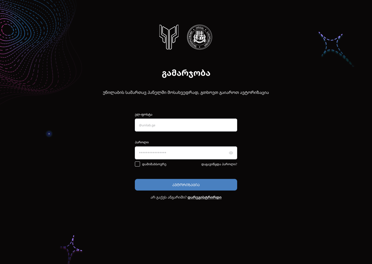
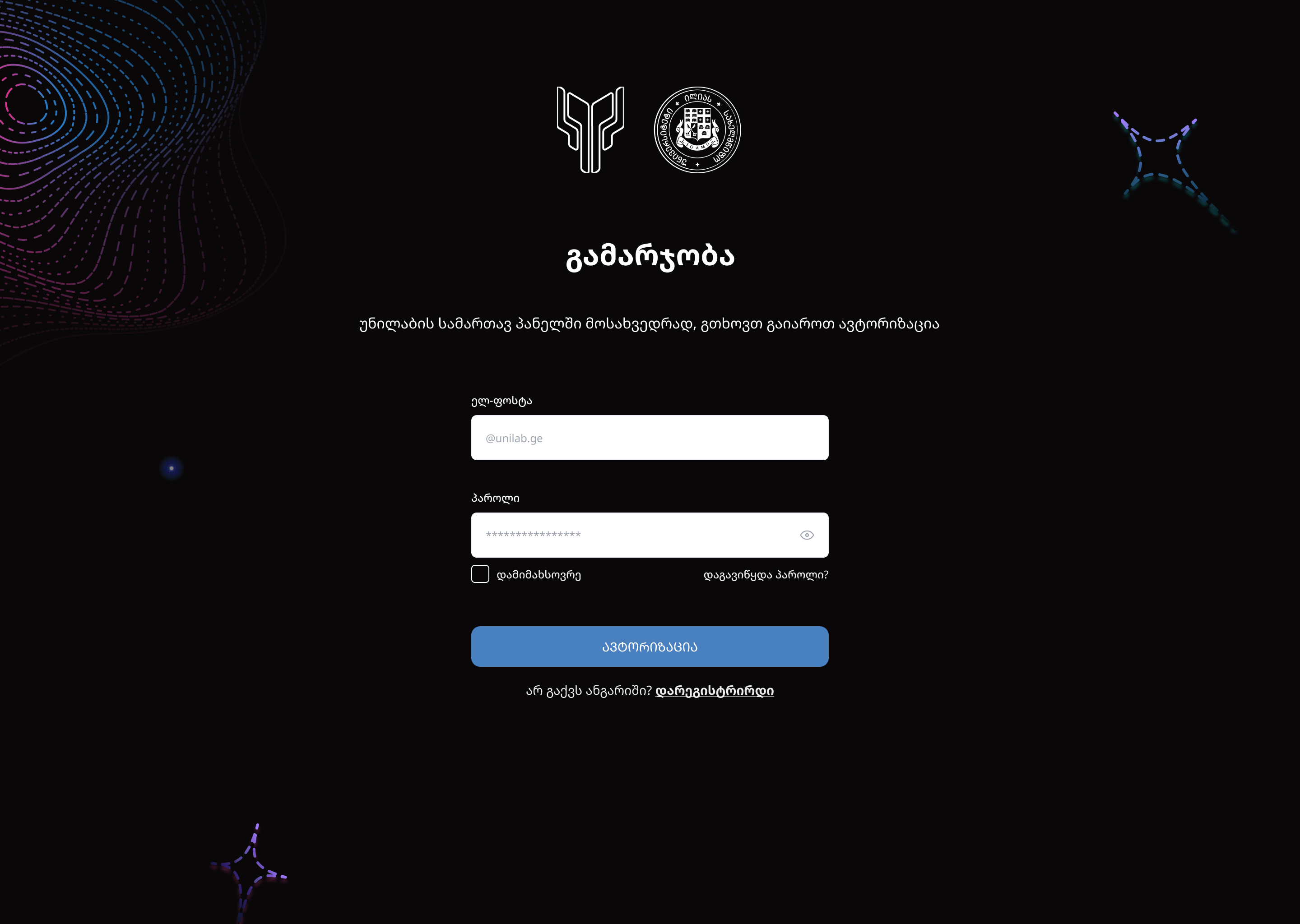
03

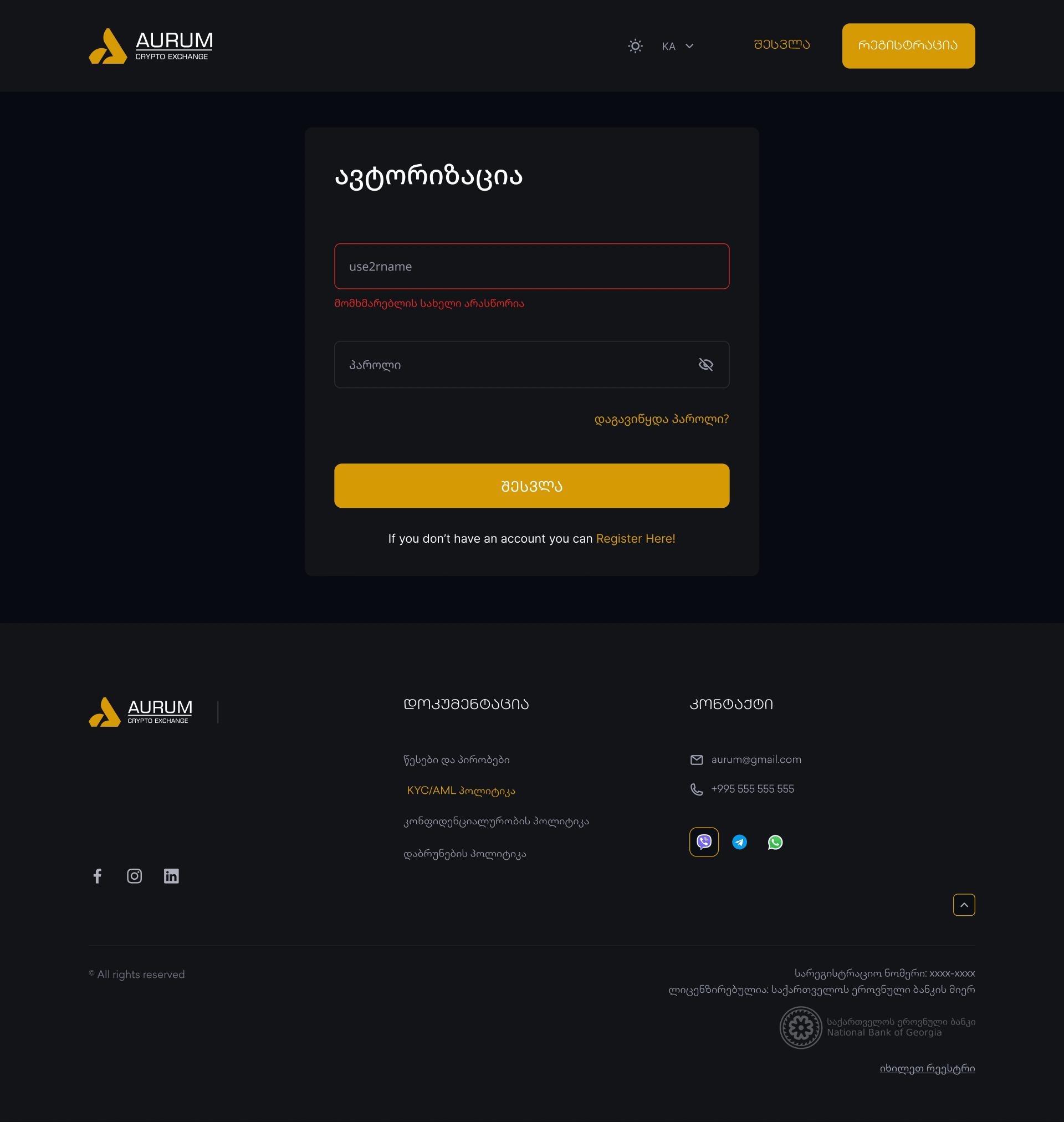
Login

Secure entry point with clean form design, trust-building visual indicators, and a clear path to account creation.

Secure login · Form design · Trust signals

aurum.exchange
Login

04

Authentication

2FA verification flow with biometric options and step-by-step guidance that makes security feel effortless and trustworthy.

2FA · Biometrics · Verification

aurum.exchange
Authentication

05

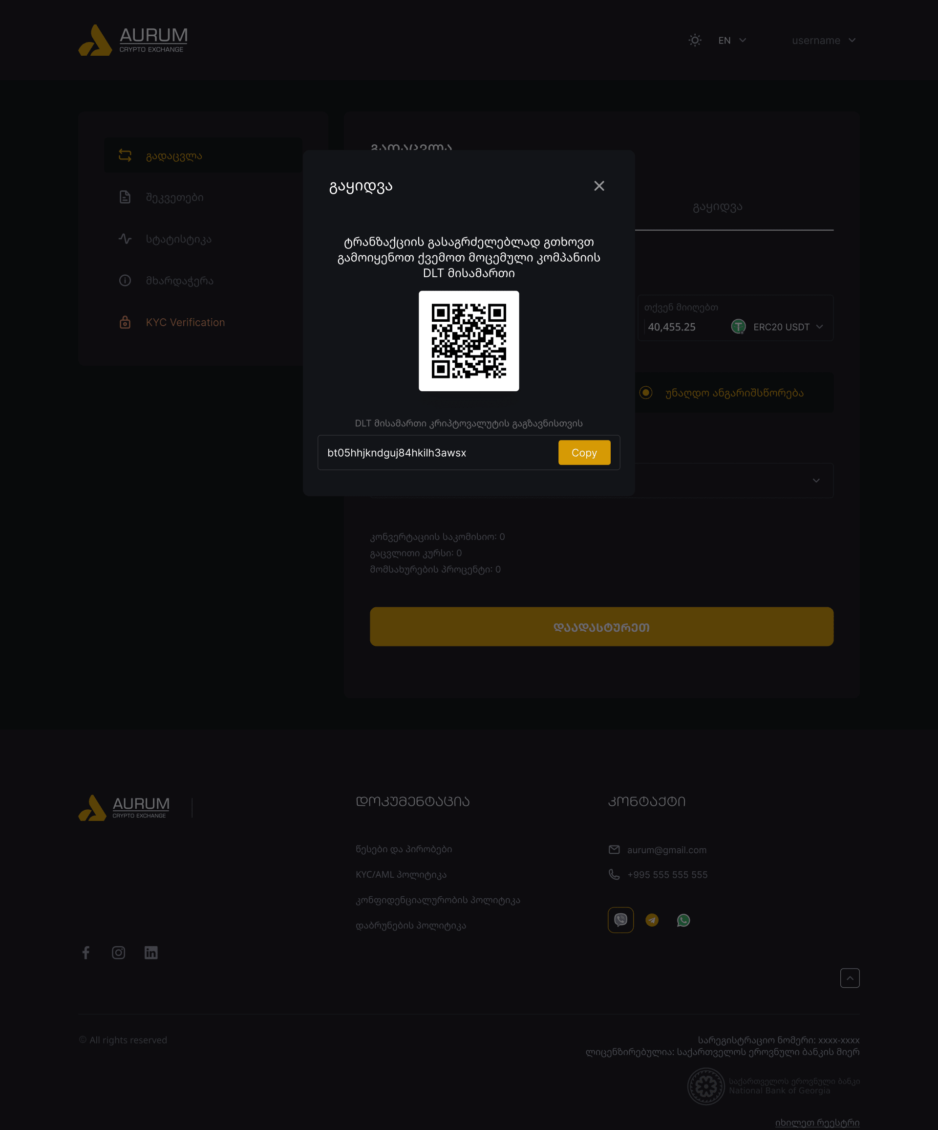
QR Transfer

Instant peer-to-peer transfers via QR code scanning, making crypto transfers as simple as sharing a photo.

P2P transfer · QR scanner · Instant send

aurum.exchange
QR Transfer

04UX stories

Onboarding, KYC gatesand the exchange flow

1 / 3
UX Story

Dual-User Onboarding

ფიზიკური vs იურიდიული პირი

Georgian regulation requires different onboarding paths for individual users (ფიზიკური პირი) and legal entities (იურიდიული პირი). The challenge was designing a single entry point that smoothly branches into two distinct verification flows without overwhelming either user type.

LoginRegistrationVerificationProfile
User Flow
Registration
Phone + Password
Account Type Selection
ფიზიკური პირი/იურიდიული პირი
Individual Path
Personal Info
Name, ID, DOB
ID Verification
Document upload
Contact Verify
SMS / Email / Telegram
Legal Entity Path
Company Info
Name, Tax ID, Registration
Director / Rep
Authorized person details
Document Pack
Extract, license, power of attorney
Contact Verify
SMS / Email / Telegram
KYC Review & Approval
Manual review for legal entities
Dashboard Access
Full platform functionality
1
Single Entry Point

One registration screen with a clear type selector reduces cognitive load and prevents users from landing on the wrong flow.

2
Progressive Disclosure

Legal entity fields (company name, tax ID, director info) only appear after selecting იურიდიული პირი, keeping the individual flow minimal.

3
Parallel Verification

Both user types reach the same verification screen but with type-specific document requirements, ensuring regulatory compliance without duplicating UI.

05Interactive preview

Live components

Interactive previews of key dashboard components, demonstrating real-time data visualization and trading widget design.

AU
AURUM
● Live
Total Balance
$128,459.32
24h Change
+2.47%
Asset24h
₿
BTC
Bitcoin
+2.34%
Ξ
ETH
Ethereum
+1.87%
◎
SOL
Solana
-0.92%
₳
ADA
Cardano
+3.14%
₮
USDT
Tether
+0.01%
Quick Exchange
FromBalance: 2.4589 BTC
1.0000
₿BTC
↕
ToBalance: 42.18 ETH
16.3241
ΞETH
Rate1 BTC = 16.3241 ETH
Fee0.1%

06Design system

AURUM design system

A comprehensive design system built for scale, 8 semantic color tokens, 2 typeface families, a spatial rhythm, and 64+ reusable components powering all 196 screens.

Color Palette

8 semantic tokens powering the entire interface

8 Colors
#D59A04
Primary Gold
Primary brand color
#FFC701
Accent Yellow
Highlights & CTAs
#080B0F
Dark Background
App background
#121318
Surface
Cards & panels
#F3F3F3
Light Background
Light mode base
#9295A6
Neutral
Muted text & icons
#10B981
Success
Positive states
#F87171
Warning
Errors & alerts
Primary Gradient
Surface Gradient
Success Gradient

Typography

Two typeface families, display and body

2 Families
Display Font
BPG LE Studio
02 Caps
Georgian display typeface for headings and brand elements
ABCDEFGHIJKLMNOPQRSTUVWXYZ
0123456789
Body Font
TBC
Contractica
Georgian body typeface for readable content and UI labels
abcdefghijklmnopqrstuvwxyz
0123456789 !@#$%
Display72px
AURUM
Hero & Page Titles
Heading 148px
Exchange
Section Headers
Heading 232px
Dashboard
Sub-sections
Body Large18px
Secure crypto trading made simple
Lead paragraphs
Body16px
Exchange your assets with confidence
Paragraphs
Caption12px
LAST UPDATED 2 MIN AGO
Labels & metadata

Spacing & Radius

Consistent spatial rhythm across all components

Spacing Scale
4px
4
8px
8
12px
12
16px
16
24px
24
32px
32
48px
48
64px
64
Border Radius
sm
6px
md
8px
lg
12px
xl
16px
2xl
24px
full
9999px

Component Library

Reusable building blocks for consistency at scale

196 Screens
12 variants
Buttons
Primary, secondary, ghost, icon
8 variants
Inputs
Text, amount, search, select
15 variants
Cards
Data, asset, transaction, info
6 variants
Modals
Confirm, alert, QR, form
4 variants
Tables
Asset list, history, rates
5 variants
Navigation
Header, tabs, sidebar, bottom
8 variants
Feedback
Toast, badge, progress, loading
6 variants
Charts
Line, candle, pie, sparkline
Button Styles
PrimarySecondaryGhostDestructiveSuccessIcon button

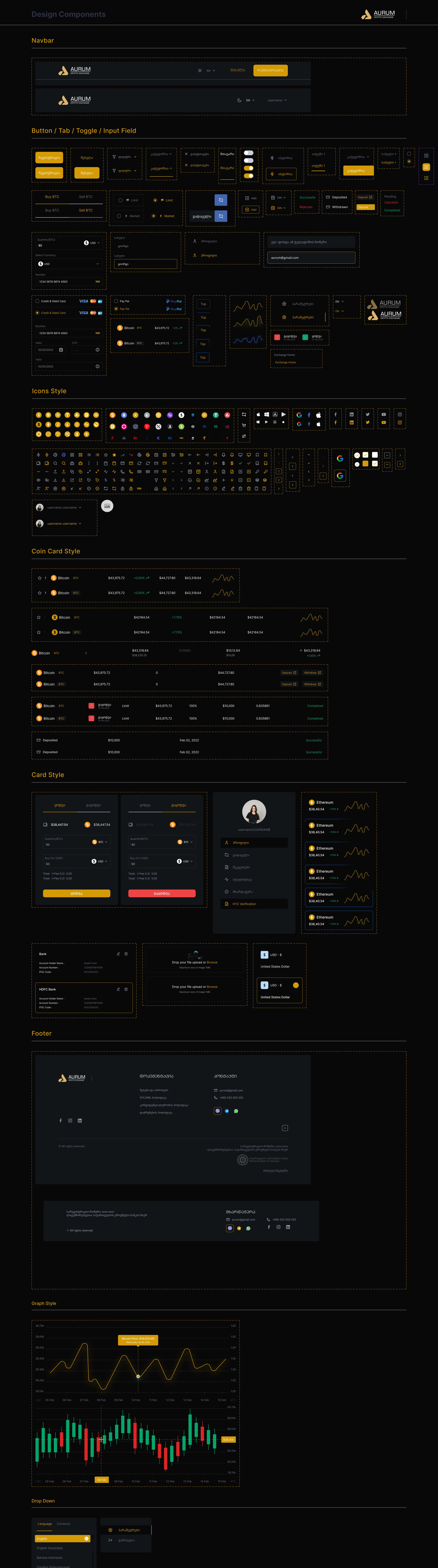
Component sheet

The complete Figma design components document · 64+ components

figma.com · AURUM, Design Components
AURUM Design System

Includes navbar, buttons, tabs & toggles, input fields, icons, use case styles, card styles, footers, chart data, QR codes and modals. Scroll inside the frame to see the full sheet.

07Design approach

Trust through craft

In crypto, trust is earned pixel by pixel. Every design decision reinforces security, clarity, and user confidence.

01

Security First

Trust indicators everywhere

02

Progressive Disclosure

Show only what matters

03

Mobile Native

Touch-optimized interactions

04

Speed

Instant visual feedback

What makes this work stand out

  • End-to-end product thinking
  • Mobile-first responsive design
  • Comprehensive design system
  • Trust-building micro-interactions
  • Guided verification flows
  • Real-time data visualization

08Outcome

A premiumcrypto experience

AURUM proves that financial products don't have to sacrifice beauty for functionality. By combining thoughtful UX research, a comprehensive design system, and pixel-perfect execution, we created a platform that makes crypto trading feel premium, secure, and accessible.

Crypto exchange · Mobile-first · Design system · 196 screens · Trust-first UX

Salome
Mosiava
Currently
Freelancing between a few brave brands and one very full sketchbook ;)
Previously
ScopeUniLabCubisten