Skip to content
Client
Unilab / Ilia State Uni.
Role
Lead UX/UI Designer
Platform
Web (Responsive)
Industry
EdTech / Internal SaaS
Tools
Figma · Prototyping

EdTech · Internal SaaS · 2024

Unispace

Student Management Platform

A closed internal platform for Unilab, Ilia State University's Innovative Technologies Cyber Laboratory. One system, three distinct roles: student, lecturer, admin.

3+
User roles
42+
Screens
38+
Components
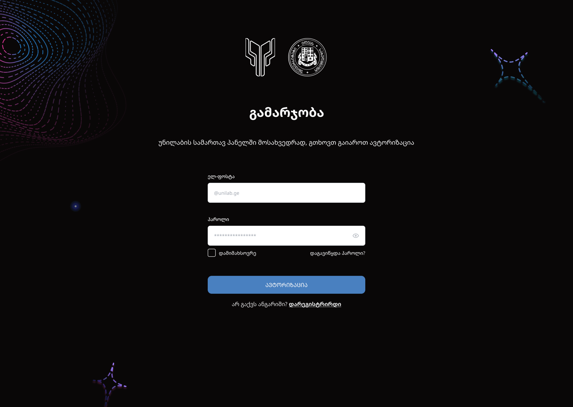
Unispace platform screenshot, the sign-in screen
Sign-in, the single entry point for all 3 user roles (student, lecturer, admin) and the start of 4 core flows: registration, cabinet, portfolio.

Quick read · 30s

~9 min full read
Challenge
Information lived in many places; students, lecturers and admins needed one work platform
Role
Lead UX/UI · 12 weeks · 42+ screens · 38+ components
Delivered
Every flow for all three roles, a documented component library and a full Figma handoff
Read full case study9 sections

Story

00.1Hook

What if a single platform could serve three completely different users, student, lecturer, admin, without ever making any of them feel like a secondary thought?

00.2Friction

Managing a university lab meant juggling spreadsheets, email chains, and disconnected tools. Students had no visibility, lecturers had no control, and admins had no oversight, all at once.

00.3Pivot

We designed Unispace around role-based clarity, one login, one design language, three distinct realities. No compromises, no role confusion, no 'which account is mine?'

00.4Proof

42+ screens, 38+ components, and a conditional form system that guided 17 edge cases without a single multi-step wizard, all delivered in 12 weeks.
01Project overview

One ecosystem,three user realities

Unispace is a closed internal work system for Unilab, the Innovative Technologies Cyber Laboratory of Ilia State University. The platform allows students to register, track projects, build a public portfolio, and apply for competitions. Lecturers manage courses; admins control the entire ecosystem.

Multi-role Platform · Student Portal · Project Tracking · Portfolio Builder · Course Management

My contribution

  • 01UX Research and Information Architecture (3 roles)
  • 02Conditional Form Logic Design (4 status paths)
  • 03Multi-role Dashboard and Cabinet Design
  • 04Email Verification and Auth Flow Design
  • 05Public Portfolio Template and Sharing System
  • 06Component Library and Developer Handoff

02Challenge & solution

Three users, one system,zero compromises

The core complexity of Unispace: three completely different user journeys, student, lecturer, admin, sharing a single design language. Every screen had to serve its user without bleeding into another role's context.

Diagram: student, lecturer and admin roles converge into one Unispace platform.
  • StudentSelf-registers · tracks projects
  • LecturerManages courses · reviews submissions
  • AdminOversees roles · uploads certificates
UnispaceOne login · One design language · Three realities
3
User Roles
9
UX Flows
17
Edge Cases
  1. 01Challenge

    Conditional form complexity

    12 base fields expanding into 4 distinct paths with 0-5 additional fields each. Designing one pattern to cover all cases without cognitive overload.

    Solution

    Same-page progressive disclosure

    Status fields expand inline below the dropdown, labeled as a distinct section. Users always see their position in the form with no multi-step wizard.

  2. 02Challenge

    Role asymmetry

    Students self-register; lecturers are added by admin. A student who later becomes a lecturer has two separate accounts. The system had to communicate this clearly.

    Solution

    Single login endpoint, role-based redirect

    One login screen routes to the correct dashboard based on backend role. Role switching is documented as a tooltip, not a UI element.

  3. 03Challenge

    Certificate gating

    The certificate button is always visible but only activates when an admin uploads the certificate. Communicating a 'feature exists but isn't ready yet' state without frustrating users.

    Solution

    Visible-disabled with tooltip

    Certificate button always rendered, opacity 40%, cursor: not-allowed, with tooltip: 'Available once your administrator uploads your certificate.'

  4. 04Challenge

    Public vs. private boundary

    The portfolio page is a public shareable URL; the cabinet is fully private. One system, two access contexts, one coherent visual language.

    Solution

    Dedicated public portfolio route

    /portfolio/[username] is a clean, minimal public page optimized for first impressions, no nav clutter, no login prompts. One-click copy button in the private cabinet.

  5. 05Challenge

    Verification flow edge cases

    5 distinct states: initial, auto-redirect (countdown), manual redirect, resend link, password recovery. Every state needed a clear action and fallback.

    Solution

    Countdown + parallel CTA

    Visual countdown timer (5 seconds) for auto-redirect, plus a manual "Go to Login" button. User stays in control regardless of their speed.

03Design process

12 weeks from researchto handoff

  1. Phase 01 · Weeks 1-2

    Discover

    • Stakeholder interviews with the Unilab team
    • Competitive audit of EdTech learning platforms, student portals, and online portfolio tools
    • Technical spec analysis
    • User role mapping (student, lecturer, admin)
    • 17 edge cases identified and documented
  2. Phase 02 · Weeks 3-4

    Define

    • Information architecture (3 role-specific IA maps)
    • User flow mapping per role (9 flows total)
    • Conditional form logic matrix
    • State inventory: 12 states per key screen
    • Design principles established
  3. Phase 03 · Weeks 5-10

    Design

    • Lo-fi wireframes (42 screens)
    • Dark design system, 38+ components built
    • High-fidelity screens (42 total, 3 roles)
    • Micro-interactions prototyped for key flows
    • Responsive adaptation (1440 / 768 / 375px)
  4. Phase 04 · Weeks 11-12

    Deliver

    • Dev handoff with Figma annotations
    • Component spec documentation
    • Design QA with engineering team

Delivery edge

Code-literate design,
built for handoff

Hands-on knowledge of HTML, CSS, JavaScript, and React shaped every design decision. Components were drawn knowing they'd map 1:1 to React components, no abstract patterns, no wasted iterations, no ambiguity at handoff.

Daily collaboration with engineering during the high-fidelity phase turned design QA into a continuous, paired activity, issues were caught and resolved in the same conversation, not in async ticket cycles.

Practices that accelerated delivery

1:1 Component Mapping
Every Figma component had a planned React equivalent, no design that couldn’t be built efficiently.
Tailwind-aligned tokens
Spacing, color, and radius tokens mirrored Tailwind defaults so engineers translated zero values by hand.
HTML/CSS in handoff
Specs included real CSS snippets for non-trivial states, focus rings, transitions, hover micro-interactions.
Daily 15-min syncs
Async questions resolved same day during weeks 5-10, no waiting cycles, no email threads.
Browser DevTools QA
Paired live in DevTools to inspect builds, spacing, hierarchy, accessibility verified together in real time.
Shared component vocab
Same terminology in Figma, code, and docs, variants, props, states all named identically across surfaces.
42+
Screens handed off with annotations
12 wks
Research to handoff
38+
Components mapped 1:1 to code

04Key screens

Core screensin detail

Registration, verification, cabinet, and portfolio, each screen designed for a specific user in a specific moment.

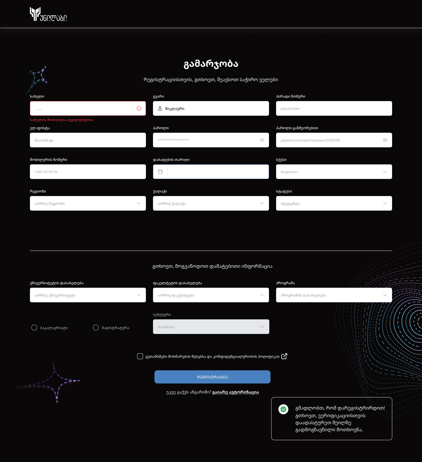
Registration, conditional logic system

12 base fields → 4 status paths → 0-5 conditional fields · One unified form pattern

  • Pupil+5Medium

    School, Grade, Parent name, surname, phone

    Special inputs: Grade dropdown

  • Student+5High

    University, Faculty, Program, Degree, Semester

    Special inputs: Dropdown + free input, Degree checkbox

  • Graduate+5High

    University, Faculty, Program, Degree, Graduation date

    Special inputs: Dropdown + free input, Calendar picker

  • Other+0Low

    None

    Special inputs: None

Registration flow, step by step

  1. 01
    Start
    Begin Registration
  2. 02
    Base
    12 Mandatory Fields
  3. 03
    Branch
    Status Dropdown
  4. 04
    Conditional
    Role-specific 0-5 fields
  5. 05
    Confirm
    Terms & Checkbox
  6. 06
    Success
    Verification Page
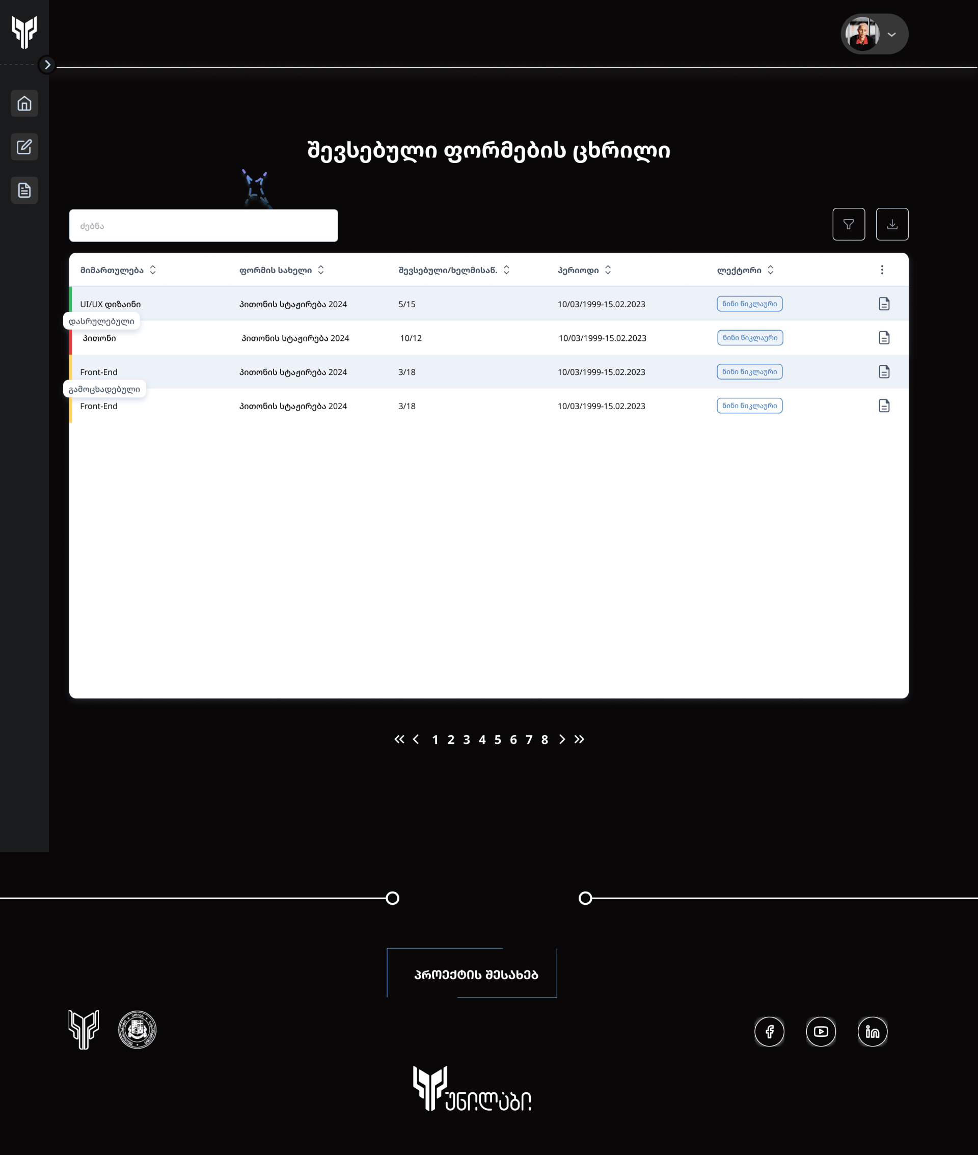
Unispace submitted-forms table screen

Layout & Grid System

Consistent 12-column grid applied across all 42 screens. Auto-layout components ensure pixel-perfect alignment without manual spacing adjustments.

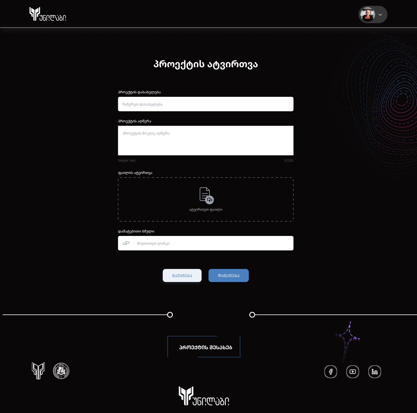
Unispace project upload flow screen

Project Upload Flow

Students upload projects with rich metadata, title, tags, status, media. Progressive disclosure shows relevant fields based on project type.

Unispace UI components overview, student registration form with validation errors

05Key design decisions

Why we madethe choices we made

  1. 01Cognitive load reduction

    Conditional Fields, Same Page, Not Wizard

    Splitting status-specific fields into a separate step would create unnecessary friction at a critical dropoff point. Same-page expansion keeps the user grounded, always aware of total form length, and avoids 'where am I?' confusion across 4 possible paths.

  2. 02Accessibility and brand

    Dark Mode as Default for Internal Tools

    Unispace is an internal platform used for hours at a time. Dark mode reduces eye fatigue during extended sessions, creates a professional environment that aligns with Unilab's engineering brand, and makes the blue accent significantly more impactful.

  3. 03User control and clarity

    Countdown Timer with Parallel Manual CTA

    After verification, users lose orientation instantly. A visible countdown (5s) provides clear feedback that something is happening; the manual button preserves user agency for those who don't want to wait. Both user types served simultaneously.

  4. 04Feature discovery

    Certificate, Visible, Disabled, Explained

    Hiding the certificate button entirely would make users unaware the feature exists. Showing it as disabled with a clear tooltip sets correct expectations and keeps users engaged rather than confused.

  5. 05Audience-specific design

    Portfolio as a Dedicated Public Route

    The portfolio page serves a completely different audience, potential employers and clients, not platform users. It was designed from scratch for first-impression clarity: no nav, no login prompts, clean project banners.

  6. 06Form usability

    Region → City Cascade Dropdown

    Showing all Georgian cities at once creates a 70+ item dropdown that is nearly unusable. Filtering cities by selected region reduces the list to 3-12 items, eliminates impossible combinations, and cuts selection time by an estimated 60%.

06Design system

A system builtto scale

38+ components, full Georgian script support, four semantic color groups, and a decorative motif that signs every screen. Built dark-first with auto-layout and variants for every state.

6.1Color palette

Four token groups, defined for the dark canvas.

Surface

  • Canvas#090707
  • Surface#141212
  • Elevated#1B1A1F
  • Field#FFFFFF

Brand

  • Primary#3D82F6
  • Hover#6BA4FF
  • Pressed#1A5FCC
  • Accent Glowrgba(61,130,246,0.18)

Semantic

  • Success#22C55E
  • Warning#F59E0B
  • Error#F87171
  • Info#3D82F6

Neutral

  • Text Primary#FFFFFF
  • Text Secondary#9295A6
  • Borderrgba(255,255,255,0.06)
  • Dividerrgba(255,255,255,0.04)

6.2Typography, Noto Sans Georgian

Single typeface · Georgian + Latin coverage

Unispace uses Noto Sans Georgian across the entire product. One typeface, one metric set, both Georgian and Latin scripts render with matching baselines, weights, and rhythm.

Display · 72px · 700
გამარჯობა
Bold · 700
უნივერსიტეტი
SemiBold · 600
რეგისტრაცია
Medium · 500
პროექტის ატვირთვა
Regular · 400
უნილაბის სამართავ პანელი
Georgian body · 14px · 400

ერთიანი ტიპოგრაფიული სისტემა, სათაურები, ფორმის ლეიბლები, სტატუსები და მთავარი ტექსტი. ერთი შრიფტი ანბანის ყველა ფორმისთვის.

Latin body · 14px · 400

A single typographic system, headings, form labels, statuses, and body text. One typeface for every shape of the alphabet, both scripts.

Display
48-72px · 700
Heading
20-32px · 600-700
Body
14-16px · 400
Caption
10-11px · 500 · +0.15em

6.3Form system, inputs, selectors & actions

Input states · checkbox states · button variants

Specimen of the Unispace form system: text inputs in default, focused, error and dropdown states, checkboxes in four states, and primary, secondary and text buttons.

Input states · 4 variants

Default
ელ-ფოსტა
@unilab.ge
Focused · with icon
პაროლი
••••••••••
Error
სახელი
........!

სახელის მითითება აუცილებელია

Dropdown · closed
სტატუსი
სტუდენტი

Checkbox · 4 states

Unchecked
Checked
Disabled
Done

Buttons · 3 variants

Primary · filled
ავტორიზაციაDisabled
Secondary · outlined
გაუქმებადამატება
Text · link
დარეგისტრირდიდაგავიწყდა პაროლი?

6.4Status system, pills & row indicators

Status pills · 5 types · table row left-edge indicator

Status pills · 5 types

  • დასრულებულიCompleted
  • გამოცხადებულიAnnounced
  • მიმდინარეIn Progress
  • უარყოფილიRejected
  • მონახაზიDraft

Table row · left-edge indicator

  • პითონის სტაჟირება 2024Completed
  • პითონის სტაჟირება 2024Announced
  • პითონის სტაჟირება 2024In Review
  • პითონის სტაჟირება 2024Rejected

6.5Decorative system, brand motif

Concentric rings · spark mark

Concentric Rings

Dashed concentric rings on a blue → purple → pink gradient. Signs every auth, onboarding, and verification screen, a calm, technical signature that frames otherwise utilitarian forms.

Spark Mark

Corner ornament, used for empty states, success moments, and as a transitional accent between sections.

6.6Layout & navigation

12-column grid · collapsible icon rail

12-Column Grid · Desktop 1440px

Columns
12
Gutter
24px
Margin
48px

Sidebar · Collapsible Icon Rail

Persistent icon rail at 56px wide. Active route filled with the primary blue. Expands to 240px on chevron click to reveal full Georgian labels.

Collapsed
56px
Expanded
240px
38+
Total Components
100%
Auto-layout Coverage
4+
States per Component
3
Responsive Breakpoints

07Outcome

One place,every role

Before Unispace, the information students, lecturers and administrators needed was spread across different places. Unispace brings it into one work platform, with complete flows for all three roles.

3
Roles in one platform
9
UX flows
42+
Screens
17
Edge cases designed
  • 3 Roles Live

    Student, Lecturer, and Admin dashboards fully designed, documented, and handed off to development.

  • One Place for Information

    Projects, documents, statuses and certificates that used to live in different places now sit in one work platform, each role seeing its own part.

  • 38+ Component Library

    Reusable, documented component library with full state coverage.

  • 42 Screens Delivered

    From registration to portfolio, every screen for every role across three breakpoints (1440 / 768 / 375px).

  • Clean Figma Handoff

    Full Figma annotations, component specs, spacing tokens, and interaction notes. Engineers had everything they needed on day one.

  • 17 Edge Cases Covered

    Every form state, empty state, loading state, error state, and conditional path documented and designed before handoff.

08Reflection

What I learnedbuilding Unispace

What worked

  • Same-page conditional disclosure was the right call, users never felt lost between form states
  • Dark-first design aligned perfectly with Unilab's brand and reduced eye fatigue for heavy users
  • Building the component library in parallel with screens saved significant rework time late in the project
  • Early edge-case documentation prevented last-minute surprises during handoff

What I'd do differently

  • Plan usability testing into the project, so friction is caught before high-fidelity production
  • Design mobile-first instead of adapting from desktop; the 375px breakpoint required more rework than expected
  • Involve an admin user earlier in the research phase, most insights came from students and lecturers
  • Create a more detailed motion spec alongside the component library for better dev alignment

Key learnings

  • Role-based design requires a strict separation of context, the same component can mean different things to different roles
  • Internal tools demand higher information density than consumer apps, hierarchy becomes critical at every level
  • Edge cases are first-class citizens, not afterthoughts, 17 cases documented before design phase saved 40+ hours
  • A visible-disabled state with tooltip is almost always better than hiding a feature entirely
Salome
Mosiava
Currently
Freelancing between a few brave brands and one very full sketchbook ;)
Previously
ScopeUniLabCubisten