Dasturi, a Georgian wine brand
The mark is a Caucasian ibex: calm, proud stance, rounded horns.
The brief: branding for a new wine company. It already knew its character and its animal, the Caucasian ibex. Everything else is mine: the mark, the wordmark, the label system and the packaging.
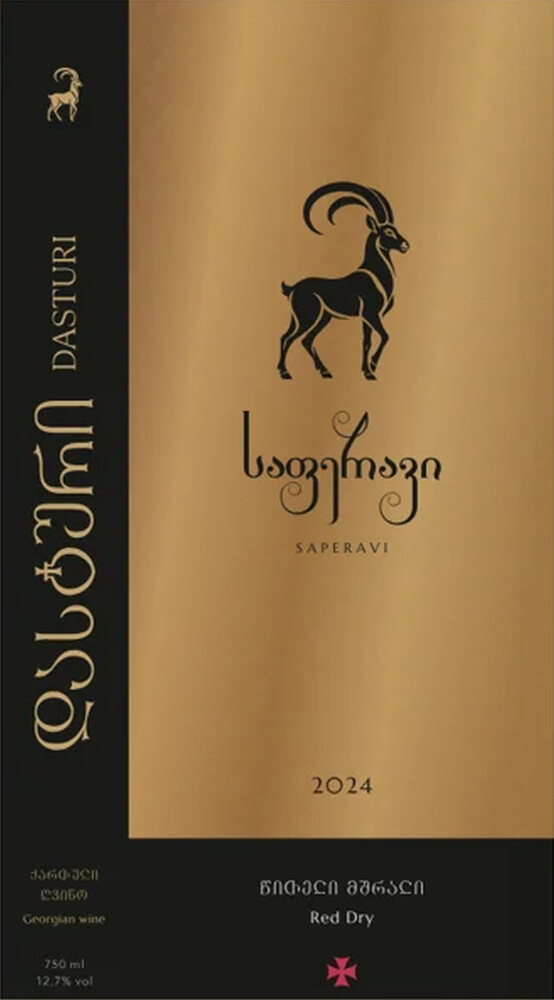
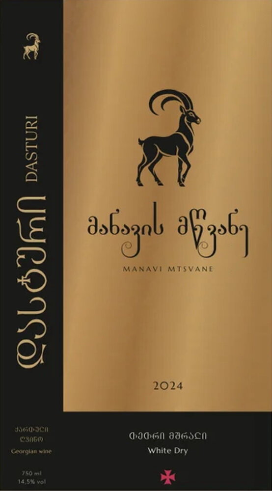
A gold panel, a black frame and a red cross turn five varietals into one family, while each keeps the colour of its wine.
An ibex built on circular arcs
Three arcs shape the horns: R 160, R 82 and R 64. White marks the stretch of outline each circle matches exactly. Clear space is 1X on every side, the cap height of DASTURI.
Five varietals, one family
Panel, frame and cross are the same on every bottle; only the varietal and the vintage change. In the gold edition the ibex is a clear cut-out that takes the colour of the wine.
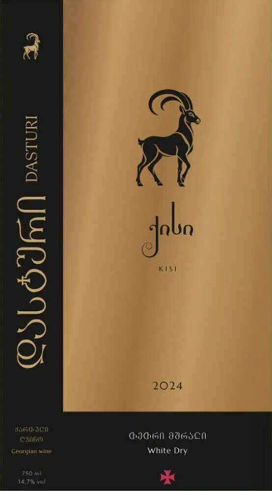
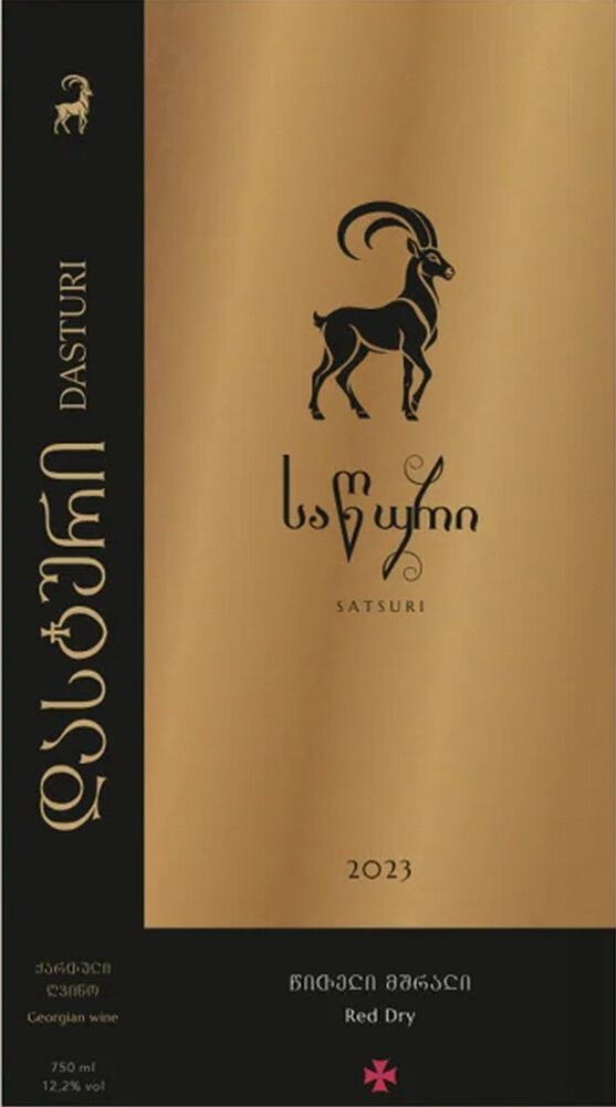
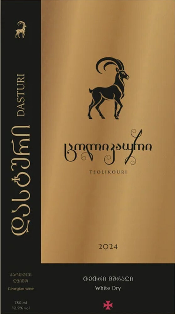
Gold foil on a bordeaux capsule
დასტური and DASTURI run vertically, as on the label frame, so the bottle reads in both alphabets on the shelf.
Four colours, four typefaces
Gold and bordeaux lead, silver supports. DM Themestia for headings, GA Lazi for the varietal, Marcellus for Latin, Avenir Next Georgian for text.
label panel
capsule, second edition
secondary
frame, text
The same system, in bordeaux
Grid, frame and bottom band stay the same. The panel turns bordeaux and the ibex solid gold, so both lines stand on one shelf as one family.
A new varietal joins by the same rule: panel, ibex, name.